




Clarity Stone
- Hex
- #EAE7E4
- RGB
- 234, 231, 228
- CMYK
- 0, 1, 3, 8
- Pantone
- 663 C
Stonecrest Partners
Stonecrest Partners is an independent wealth management firm that provides personalized financial guidance to individuals, families, institutions, and advisors. Through trusted relationships and thoughtful strategies, the firm helps clients confidently navigate complex financial decisions.
We are the
Traits
Makes consumers feel
We don't assume the first answer is the right one. We stay open, ask better questions, and look beyond standard thinking to uncover opportunities others might miss. Our confidence comes from experience—not from believing we already know everything.
"There may be a better path forward than the obvious one."
"We follow a standardized investment framework designed to optimize consistency."
We write like trusted advisors, not institutions. Every conversation should feel thoughtful, approachable, and grounded in real relationships. We explain complex ideas clearly without relying on financial jargon or polished business speak.
"We take the time to understand what matters to you before recommending what's next."
"Our client-centric approach enables customized financial outcomes."
Markets change. Headlines come and go. Our voice remains calm, measured, and confident through uncertainty. We help people make thoughtful decisions instead of emotional ones, offering perspective before urgency.
"Complex markets require thoughtful decisions, not emotional reactions."
"Act now before market conditions create irreversible downside exposure."
We believe the best opportunities are often found beyond conventional thinking. By embracing curiosity and independent perspective, we help clients uncover possibilities that others may overlook.
Every client relationship is built on trust, understanding, and genuine connection. We take the time to understand each client's goals, providing guidance that is as personal as it is strategic.
Confidence comes from thoughtful decisions, not unnecessary complexity. We remain steady, transparent, and focused, helping clients navigate change with clarity and long-term perspective.
The core of our brand
The Stonecrest Partners wordmark embodies a sense of quiet confidence and sophistication. Its timeless, understated design reflects a firm that is established and credible while remaining personal and approachable.
Only set it in the following approved colorways, primarily showcasing the mark in Clarity Stone and Confident Charcoal. The True White and True Black colorways are only to be used on brand partnership collateral when required by brand partners.

The SP Icon is a distilled expression of the Stonecrest Partners identity. Connecting the “S” and “P” with a single continuous line, the mark symbolizes the trusted relationships that define the firm. More than a monogram, it represents the partnership between Stonecrest and its clients—built on connection, guidance, and a shared path toward long-term success.
Our SP Icon should primarily be set in the Stone White and Confident Charcoal colorways. In select applications, the connecting rule may be extended or stretched to create a graphic element that reinforces connection and movement while maintaining the integrity of the “S” and “P” letterforms. Its compact form makes it ideal for digital applications, social media, merchandise, and other branded touchpoints.

Our partnership logos follow the same typographic structure as the primary Stonecrest Partners logo, pairing the Stonecrest wordmark with the partner name below. To maintain consistency and brand recognition, always use the approved brand colorways. A true black and true white version is also provided for partners whose brand standards or production requirements call for a neutral, one-color application.
Partnership Logo Advisors Charcoal
PNG
Partnership Logo Advisors Stone
PNG
Partnership Logo Advisors True Black
PNG
Partnership Logo Advisors True White
PNG
Partnership Logo Capital Markets Charcoal
PNG
Partnership Logo Capital Markets Stone
PNG
Partnership Logo Capital Markets True Black
PNG
Partnership Logo Capital Markets True White
PNG
Partnership Logo Holdings Charcoal
PNG
Partnership Logo Holdings Stone
PNG
Partnership Logo Holdings True Black
PNG
Partnership Logo Holdings True White
PNGour logo

When displaying any of the logo variations, maintain ample space around it to avoid crowding or interference from other elements. To achieve this, don’t place anything within the “safe space” equivalent to 10% the width of the logo.
*Of course, there are exceptions: subtle patterns or textures overlapping at 20% opacity or less are acceptable.

Use unapproved color combinations or colors

Distort the logo and elements

Mask images into the logo

Place on backgrounds that make elements hard to read

Use alt fonts
Stonecrest Partners In
Clarity Stone
Confident Charcoal
Navigator Green
Secondary colors are intended to support the primary palette by introducing depth and visual interest across the brand. They work best as accents for backgrounds, key graphics, callouts, and supporting brand elements.
Heritage Brown
Growth Sage
Venture Orange
Typography
Subheadings, IBM Plex Mono Regular, All Caps, +100 Tracking
A B C D E F G H I J K L M N O P Q R S T U V W X Y Z 1 2 3 4 5 6 7 8 9 0 ! @ # $ % ^ &
Headings - Trust 3A Light, -10 Tracking
Accent - Awesome Ways Regular
Aa Bb Cc Dd Ee Ff Gg Hh Ii Jj Kk Ll Mm Nn Oo Pp
Qq Rr Ss Tt Uu Vv Ww Xx Yy Zz
1234567890!@#$%^&
Body - Manrope Regular, Sentence Case
Aa Bb Cc Dd Ee Ff Gg Hh Ii Jj Kk Ll Mm Nn Oo Pp
Qq Rr Ss Tt Uu Vv Ww Xx Yy Zz 1234567890!@#$%^&
depth through

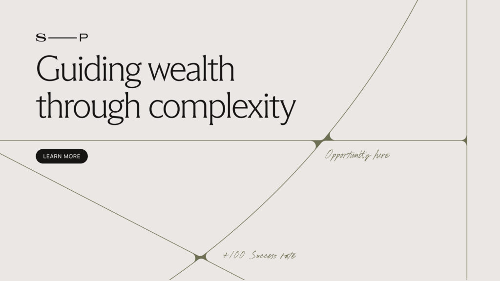
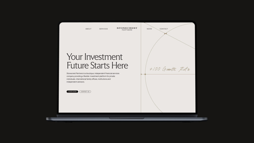
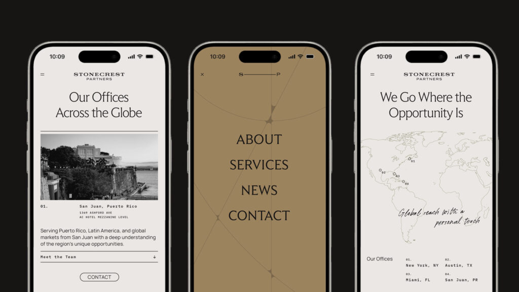
The line elements are inspired by the idea of navigation, representing the unique paths clients take throughout their financial journey. Intersecting and connecting across the brand system, they symbolize trusted guidance, meaningful relationships, and Stonecrest's ability to bring clarity to complex financial decisions.
These elements should be used thoughtfully to frame layouts, create movement, and establish a cohesive visual language without competing with the content.

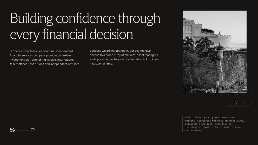
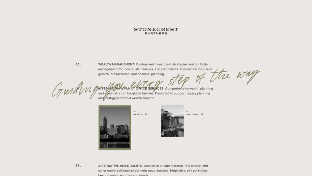
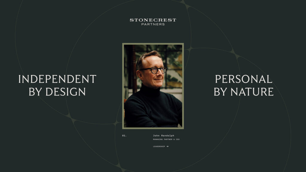
Stonecrest's photography was intentionally created to reflect the people, spaces, and relationships that define the firm. By capturing the team within their own environments, the imagery reinforces an authentic, approachable presence while communicating confidence, trust, and professionalism.
The custom photography library should serve as the primary visual resource across all brand touchpoints to maintain a consistent and recognizable identity.
Brand in action